What is Visual Merchandising?
Visual merchandising is the appearance, design, and visual presentation of products and services in a store. It is the art of optimizing product placement to attract customers’ attention and encourage purchases. Visual merchandising is a comprehensive system that covers everything—from product arrangement in-store, window displays, and advertising signage to creating a specific atmosphere through lighting, music, or scent.
Goals and Objectives of Visual Merchandising
Visual merchandising is a tool aimed not only at showcasing products but also at establishing effective communication with the customer. Its goals and objectives include:
- attracting customers and drawing attention to key products;
- highlighting priority or seasonal items and guiding customer traffic throughout the store;
- emphasizing product benefits through visual accents;
- helping customers find the desired item by category, type, or price;
- reducing decision-making time through logical and convenient layout;
- encouraging purchases, including impulse buys, through the design of windows, checkout areas, and special displays;
- creating a comfortable and pleasant shopping atmosphere;
- managing product placement efficiently and simplifying inventory control;
- strengthening the brand’s visual image and increasing the appeal of the retail space;
- building customer loyalty through clear navigation and positive shopping experiences.
Additionally, one of the key objectives is to increase the average transaction value by thoughtfully organizing the assortment and encouraging the purchase of related products.
By following every point of this strategy, you can smoothly guide the customer to the checkout and gain a loyal client.
Why Do Retailers Still Need Visual Merchandising?
Visual merchandising has always been a way to increase sales. As long as a retailer’s end goal remains reputation and revenue, visual merchandising will remain relevant. As long as customers need products, retail will exist—and visual merchandising will continue to help attract customers and boost sales.
It might seem that with the rise of online stores, retailers no longer need to rely on visual merchandising. But that’s not true. In the case of e-commerce, retailers make significant efforts to visually present not only the product but also the entire website design and user experience.
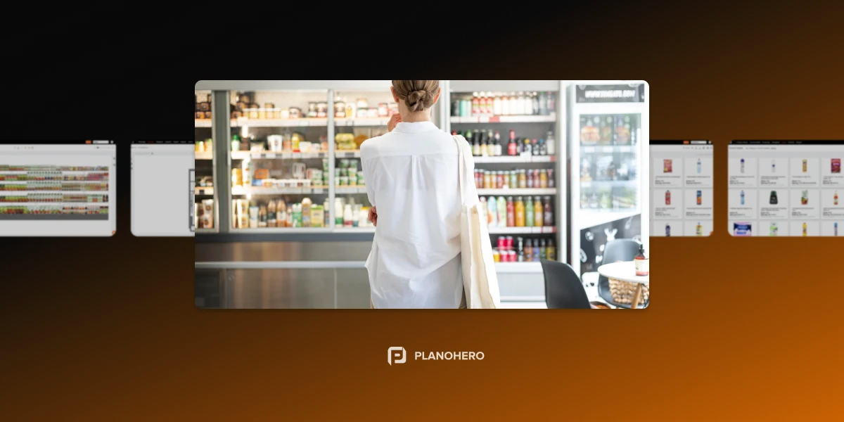
Despite the development of digital channels, physical retail spaces still play a vital role. This is especially true for products that require tactile interaction, such as fashion apparel, cosmetics, or home goods. Here, atmosphere, visual accents, rest areas, and even scent become important. These factors enhance emotional engagement and influence purchase decisions.
Elements of Visual Merchandising
1. Color
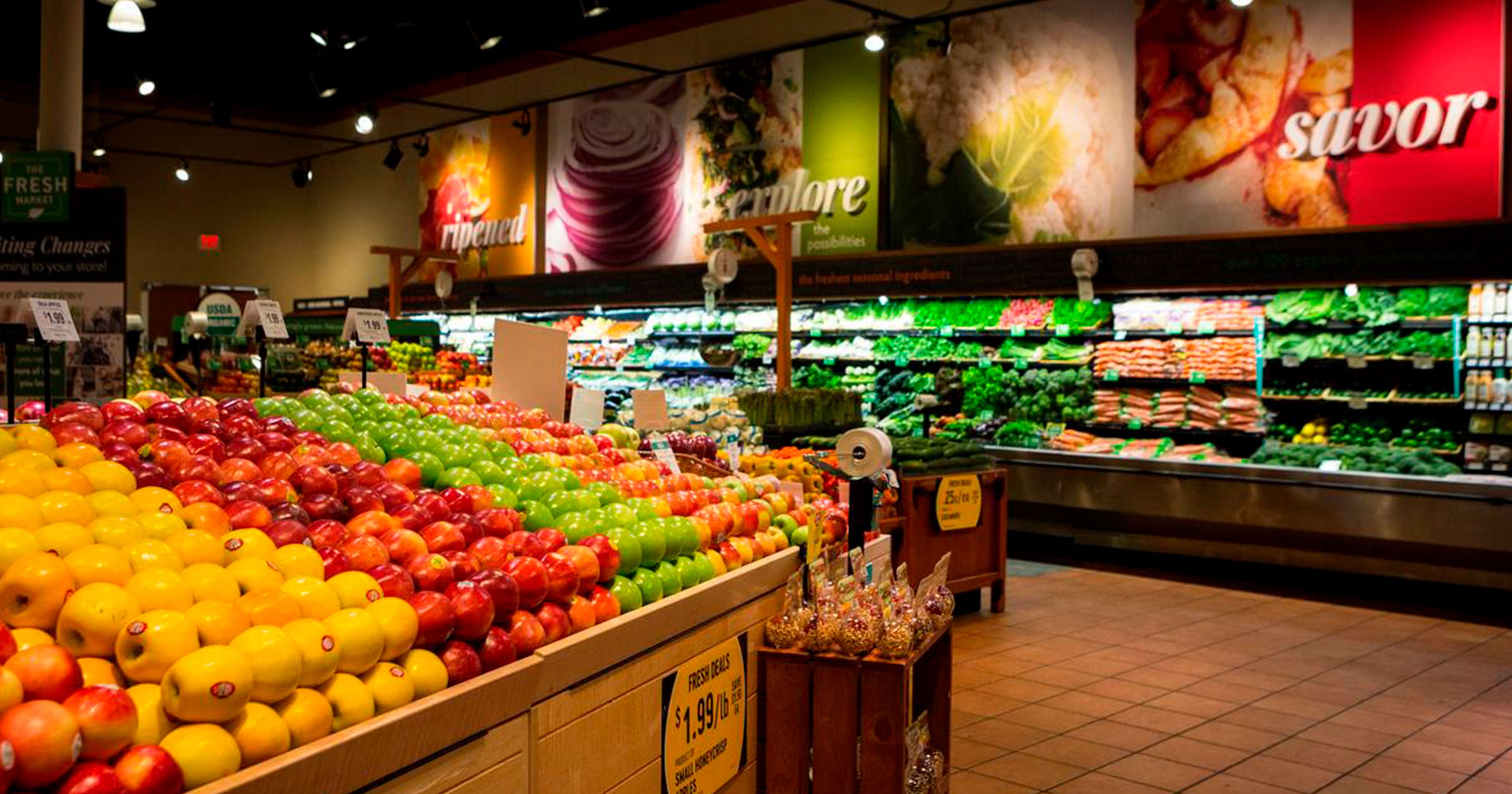
Color is a crucial part of a store’s visual design. Through color, certain items on shelves can be highlighted, a comfortable atmosphere created, and customers’ attention drawn, for example, through bright packaging or signage. Contrast is another technique: placing a neutral-colored product against a vivid background, or surrounding a brightly colored product with neutral tones.
Important: Avoid an overabundance of contrasting colors. Everything should be in balance and harmony. Consider the brand's color palette.
Additionally, color should align with the emotional message of the product: warm tones convey coziness, cool tones emphasize technology or cleanliness, and neutral shades suggest a minimalist or premium positioning.
2. Lighting
Lighting effectively highlights the features of your products. By using different lighting types, you can promote new items or change the presentation of existing ones. Playing with lighting helps draw attention and create a cozy atmosphere in the store.
Lighting also sets the pace of customer movement throughout the store, divides areas by function, and creates emotional accents. Light can be directed to focus attention or diffused to create background ambiance.
3. Store Space
Another important aspect of visual merchandising is the store layout. This involves planning equipment and product placement, managing the floor, and using the space as efficiently as possible.
Important: How you use space in the store directly affects future sales.
A challenging situation arises when merchandisers notice empty areas on the sales floor. Retailers typically approach this in two ways:
One opinion is that every square foot should generate sales. If it's financially difficult to add new fixtures or products, this space can be rented out to a supplier, for instance.
Another opinion holds that an overloaded store without free space looks chaotic. Negative space (also called “white space”) is essential in design. The idea is that free space helps highlight certain items and gives products room to “breathe.” Hence, not every square meter needs to be filled with products.
Dividing the sales floor into functional zones (hot, warm, cold) allows control over customer movement and enhances the impact. Hot zones—near entrances or along main traffic routes—should display new arrivals, bestsellers, and promotions. Cold zones need special attention and can attract visitors through navigation signs or interactive elements.
4. Visibility
For a product to be purchased, the customer must see it. Therefore, the merchandiser must ensure product visibility.
Good visibility means the absence of visual noise. Avoid overloading displays, and simplify the product selection process. At the same time, focus on recognizable shapes, large packaging, and bright signal colors.
5. Product Display and Layout
The way products are laid out on the shelves greatly influences sales.
Product layout is the store’s language. It should be logical, rhythmic, and able to answer customer questions without words.
Common display types include:
- Vertical layout – a single product or brand is displayed from top to bottom. This makes items accessible to customers of different heights.
- Horizontal layout – products are placed across the shelf. Important items are positioned at eye level.
- Display layout – promotional or seasonal products are placed in dedicated areas with strong visual support.
- Brand block – shelf space is allocated to a single brand.
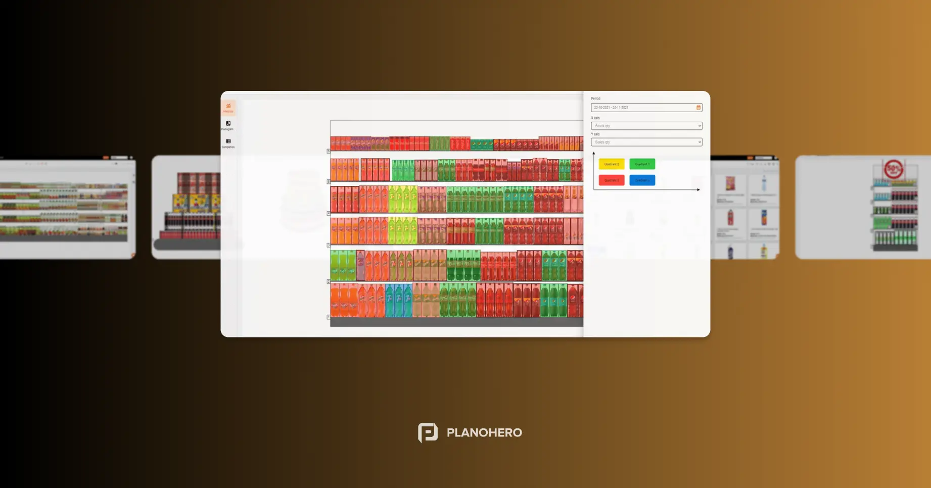
To effectively organize product placement and layout, planograms are used. Planograms are developed based on the basic principles of merchandising.
Visual Merchandising: Key Principles and Rules
Visual merchandising relies not only on creativity but also on a clear system of rules and principles. It’s a kind of “cheat sheet” for anyone who wants products to sell themselves and the store to function like a well-oiled machine. By following these visual merchandising rules, you can organize your store’s space so that every element works to attract and retain customer attention.
Rule #1: Consider Demand and Display Levels
A retailer must ensure a reasonable stock of products in the store in accordance with demand. Keep in mind that the most visible products to customers are those placed at eye and hand level. The most convenient product selection areas are typically to the right of a customer moving through the store. Cash registers are usually placed to the left of the store entrance. Small items and accessories are positioned near the checkout area to catch the customer’s eye and prompt impulse purchases.
Display zones are generally divided into four levels:
- the “gold level” (eye level — the most profitable),
- the “silver level” (hand level — second most effective),
- the “bronze level” (below the waist — less noticeable),
- and the bottom or technical level (used for large packages or surplus stock).
This hierarchy should be taken into account when arranging the assortment.
Rule #2: Highlight Promotional and Priority Products
Make sure the target product stands out against neighboring items—for example, during promotional campaigns. Use bright colors, unusual packaging, lighting, POS materials, and more to make the promotional product more noticeable.
You can also use floor graphics, stoppers, wobblers, shelf talkers, and place promotional items in so-called “flow zones”—the main paths customers follow. A good tactic is to duplicate the promotional offer in several areas of the store to increase customer contact with the product.
Rule #3: Placement of Fast-Moving Goods
Best-selling or high-demand items should be placed at eye level.
You should aim for an average eye level of 150–160 cm (approx. 5–5.3 ft). This is where customers' gaze lingers the longest, and sales are highest.
Shelves at this level are often called “golden shelves” and are the most profitable.
These products can also serve as “anchors” that attract customers to a section, after which they notice other, less popular items. It’s also recommended to place complementary (cross-sell) items next to fast-movers to boost additional sales.
Rule #4: Group Products by Logic and Scenario
Group products properly. Place items logically based on type and characteristics. You can group by price, product category, size, or weight. Create an intuitive display so the customer can easily navigate between shelves and quickly find the needed product. Also, consider product compatibility.
Another effective method is “scenario-based displays”— grouping products into logical sets for specific life situations. For example:
- “Everything for breakfast.”
- “Summer skin care”
- “Picnic set”
This simplifies decision-making, stimulates extra purchases, and saves the customer time.
Rule #5: Working with “Dead Zones”
“Dead zones” are areas outside of the customer's direct line of sight. We typically ignore what's at floor level. The lower left corner of the shelves is almost invisible to the eye. So, it's advisable to place large-sized items or stock in these bottom areas.
It’s also important to assess areas like corners, narrow aisles, end caps, and entrance zones. Many of these can be transformed from “dead” to active zones using proper lighting, mirrors, visual accents, or limited-time offers. End caps are especially effective for impulse and seasonal products.
Rule #6: Use the Rule of Thirds
The Rule of Thirds is a visual composition principle used in photography, design, and visual merchandising. It involves dividing space into nine equal parts using two horizontal and two vertical lines. Key display elements are recommended to be placed along these lines or at their intersections.
This creates a balanced, aesthetically pleasing, and intuitive visual layout. Applying this rule allows you to:
- Effectively highlight key or promotional products;
- Direct customer attention without visual overload;
- Create professional-looking displays and photo zones.
For example, when designing a window display, place the focal product not in the center, but near the intersection of the imaginary grid lines—this creates a dynamic and memorable composition. Inside the store, the same principle can be used for display stands, branded zones, and fixtures.
It’s important to remember: visual merchandising is not just about putting products on shelves. It’s about building the right communication with customers to boost loyalty and revenue.
With consistent analysis and a thoughtful approach to product display and presentation, you can achieve your business goals. Visual merchandising remains essential for any retailer offering products that customers want to buy.
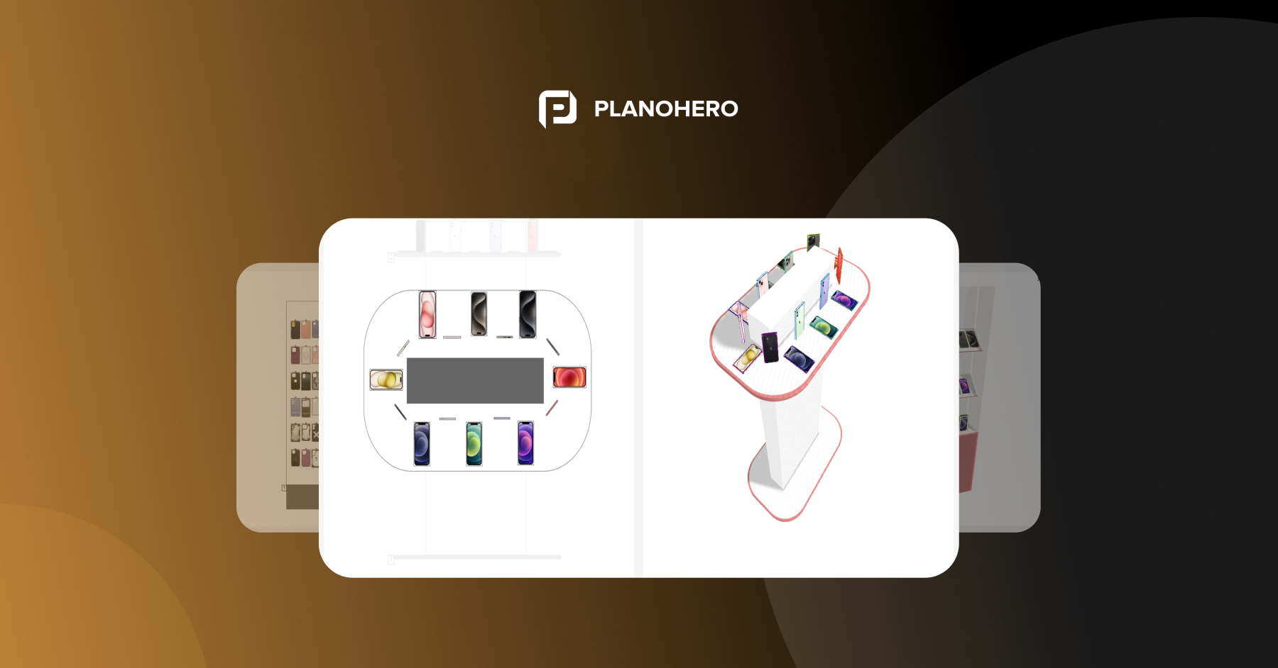
Digital tools greatly simplify these processes. For those who want to streamline and automate all visual merchandising and planogramming tasks, we recommend the cloud service PlanoHero. With it, you can:
- create store layouts,
- design retail equipment,
- build planograms and set product displays,
- manage assortments,
- monitor planogram execution with photo reports, and analyze the effectiveness of each planogram and the store overall.
All in one convenient interface.
¿Buscas un servicio para crear planogramas?
Prueba la versión demo gratuita de PlanoHero