Colors are one of the most powerful visual elements in retail. They influence mood, purchasing decisions, and how customers perceive your store. Merchandising color order—the practice of arranging products by color—is more than an aesthetic strategy. It is a science-driven approach that combines psychology and design principles to maximize visual appeal and increase sales.
Why Merchandising Color Order Matters in Retail
Shoppers make split-second judgments based on what they see. Colors account for the majority of first impressions and can influence buying behavior more than price or product design. A structured retail color order simplifies the shopping experience, provides visual clarity, and encourages customers to explore more products.
Unlike brand-driven displays, which can appear disjointed, visual merchandising color order creates a natural flow that draws the eye, organizes products intuitively, and keeps the store looking modern and professional. When done right, this approach helps:
- Increase impulse purchases
- Improve navigation within the store
- Strengthen brand identity
- Support seasonal or trend-based marketing
The Psychology of Color in Retail
Every color triggers a different emotional response. Understanding this psychology allows retailers to influence how customers feel and act.
|
Color |
Emotion & Effect |
Best Use in Retail |
|
Red |
Urgency, excitement |
Clearance zones, limited-time offers |
|
Orange |
Warmth, friendliness |
Mid-priced items, casual fashion displays |
|
Yellow |
Optimism, cheerfulness |
New arrivals, featured zones |
|
Green |
Calmness, trust, nature |
Organic, eco-friendly products |
|
Blue |
Stability, reliability |
Electronics, premium and luxury goods |
|
Purple |
Creativity, sophistication |
Beauty products, upscale fashion |
|
Black & White |
Simplicity, minimalism |
Premium layouts, brand storytelling |
By selecting colors that align with your goals, you can create a store atmosphere that subtly encourages desired behaviors. For example, warm colors like red and orange evoke energy and urgency, making them ideal for promotions. In contrast, cool tones like blue and green suggest trust and relaxation, which works well for high-value or premium products.
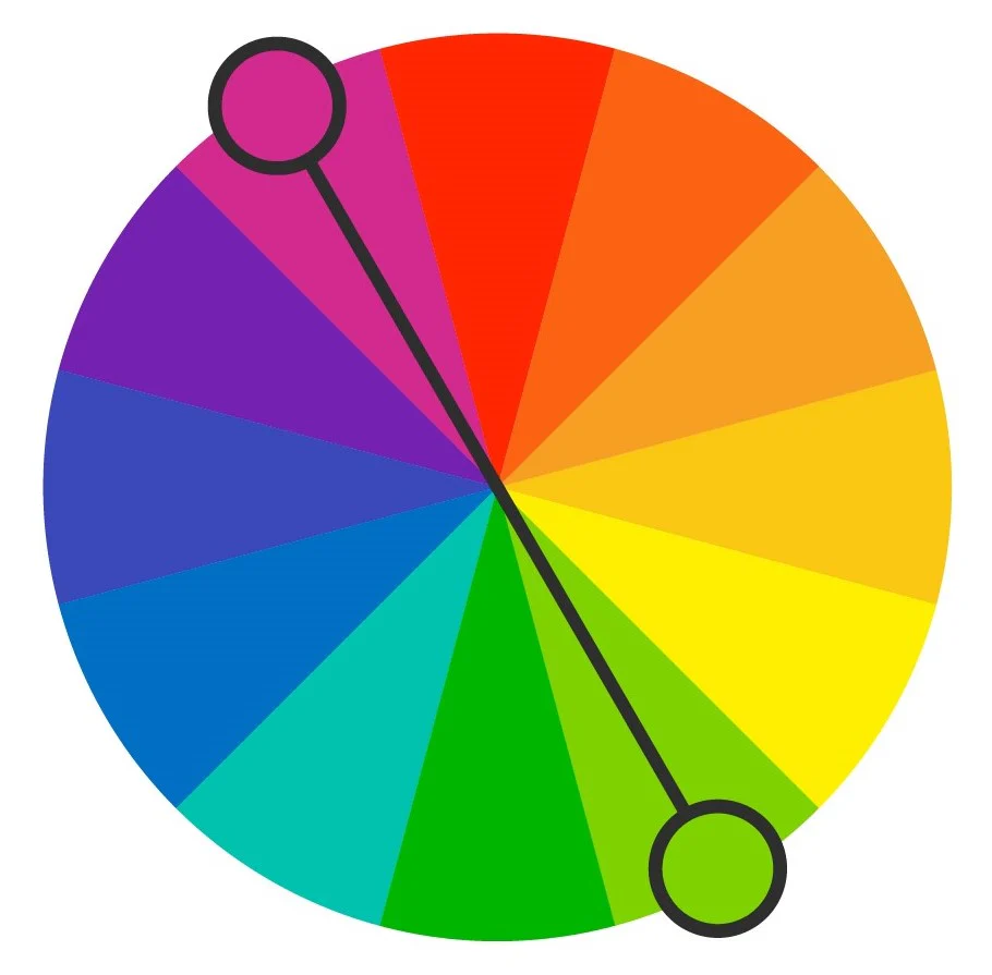
Understanding the Retail Color Wheel
The retail color wheel is a visual guide to arranging colors harmoniously. It includes primary colors (red, blue, yellow), secondary colors (green, orange, purple), and tertiary shades created by mixing these.
When using the color wheel in displays, retailers can apply several approaches:
- Analogous colors—those next to each other on the wheel—create a harmonious and soothing look.
- Complementary colors—opposites on the wheel—offer strong contrast and energy.
- Monochromatic schemes—different shades of a single color—deliver elegance and unity.
The color wheel is the backbone of any color-based merchandising strategy, allowing you to create layouts that are visually appealing and psychologically engaging.
Techniques for Organizing Products by Color
Gradient Arrangement
Gradient displays move from light to dark within the same color family. This technique creates a seamless, elegant flow that feels premium and highly organized. It works especially well in apparel, footwear, and home décor stores where customers want to compare shades easily. For example, a display of blue shirts transitioning from pale sky blue at one end to deep navy at the other gives a polished, modern appearance that encourages exploration.
Rainbow Display
A rainbow display follows the natural color spectrum—red, orange, yellow, green, blue, indigo, violet. This creates energy and excitement, making it ideal for products that thrive on variety, such as cosmetics, toys, and craft supplies. When implemented in wide shelving or wall displays, the rainbow effect becomes a visual magnet, pulling shoppers toward the section because it is both organized and playful.
Color Blocking
Color blocking involves grouping products of the same color together in solid blocks. This technique creates bold, eye-catching zones that feel dynamic and modern. It is particularly effective for fashion retailers launching seasonal collections or themed promotions. By clustering all yellow dresses in one area and all red dresses in another, you create instant impact and simplify browsing for color-specific preferences.
Accent Color Technique
The accent color strategy uses a single contrasting color in an otherwise neutral or harmonious display to draw attention to key products. For example, in a display dominated by cool blues and greens, adding a bright red handbag in the center will make it the focal point. This approach is ideal for promoting new arrivals, high-margin products, or special offers without disrupting the overall aesthetic.
How to Apply Visual Merchandising Color Wheel in Practice
Applying the visual merchandising color wheel to your retail layout requires deliberate planning. Start by identifying your primary color focus. This could be your brand’s signature color, the season’s trend shade, or a promotional color tied to a campaign. Once the anchor color is chosen, build out your display using color theory:
If your goal is balance and harmony, use analogous colors—those located next to your base color on the wheel. For a vibrant and high-energy display, select complementary colors positioned opposite each other. For a premium and minimalist effect, choose a monochromatic palette and play with different tones and textures within the same hue.
Lighting is another critical factor. Ensure that your light sources preserve color integrity. Warm lighting can make colors appear softer, while cool lighting sharpens them. Adjustable spotlights can be used to emphasize certain products or create contrast that directs the shopper’s attention strategically.
Color as a Navigation and Zoning Tool
Color does more than enhance aesthetics—it organizes the retail space. In large stores or supermarkets, retail color order can serve as a zoning system that simplifies navigation. For example, assigning distinct color themes to different departments makes the layout intuitive: green for health and wellness, blue for technology, and orange for seasonal promotions.
Beyond navigation, color zoning can also influence shopping flow. Bright, stimulating colors near the entrance draw customers inside, while calming tones in deeper areas of the store encourage them to linger. Clearance sections often rely on red signage and colored tags to signal urgency and savings, driving quick decisions.
Seasonal Color Strategy: Keeping Displays Fresh
Seasonal adjustments to your visual merchandising color order keep your store feeling relevant and dynamic. Spring calls for pastels like lavender and mint to evoke freshness and renewal. Summer thrives on bold, bright hues such as yellow, coral, and turquoise that radiate energy. Fall displays benefit from earthy, rich tones like burgundy and mustard that mirror the changing season. Winter invites a cooler, more sophisticated palette with silver, icy blue, and deep navy.
Refreshing your color displays each season signals that your store is current and trend-aware, encouraging repeat visits and inspiring shoppers to update their wardrobes or homes accordingly.
Example Table: Color Merchandising Strategies
|
Strategy |
Description |
Ideal For |
|
Gradient Display |
Light-to-dark shades within the same color |
Apparel, home décor, beauty displays |
|
Rainbow Display |
Colors arranged in natural spectrum order |
Toys, cosmetics, arts & crafts |
|
Color Blocking |
Large product groupings in solid color blocks |
Seasonal promotions, fashion launches |
|
Accent Color Focus |
One contrasting color as the focal point |
Featured products, high-margin items |
Mastering merchandising color order is a game-changer for retailers. It blends aesthetics with strategy, turning ordinary shelves into captivating, sales-driven displays. By applying the merchandising color wheel, understanding color psychology, and adapting to seasonal trends, you can create an engaging environment that motivates customers to shop longer and spend more.
If you’re looking for a smart way to implement these strategies and optimize your retail layouts, PlanoHero can help. This professional planogram solution makes it easy to design color-coordinated displays, manage shelf space, and boost sales with data-driven merchandising.
Looking for a service to create planograms?
Try a free demo version of PlanoHero