What is Visual Merchandising?
Visual merchandising is a strategy that influences customer purchasing decisions. This is a special method of organization and placement of merchandise to attract the shoppers' attention. The goal is to interest store visitors and inspire them to buy more items than they planned.
For a better understanding of visual merchandising it is necessary to divide it into three main components:
- Optimizing the store space (store layout) for a better product presentation;
- Highlighting products, their advantages, and characteristics through different layout strategies;
- Attracting buyers' attention, and motivating them to purchase goods.
Effective Visual Store Merchandising. Tips and Ideas
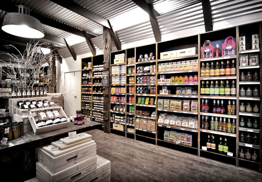
- Use a Specific Color Scheme for the Design of the Trading Floor and Display
Color is one of the decisive components of design and affects the perception of the store atmosphere by the client. It is important to stick to the chosen color palette. Colors are associated with emotions and can influence the client's impression of the surrounding space. Don't use too many colors. Some colors evoke feelings of happiness, joy, and calmness and create an atmosphere of comfort. Others, on the contrary, are able to emphasize negative emotions, as well as the small size of the sales area.
Also, color is a link to the brand, promotion, and something like a reminder to customers where they are. Have you ever wondered why Mcdonald's uses red and yellow in their restaurant branding and design? Thus, the red color is a symbol of expression, it cheers up, excites the mind, has strong activating properties, and can stimulate impulse purchases. Yellow is a symbol of joy, optimism, positive. This color improves digestion and inspires confidence. Children, first of all, begin to distinguish this particular color from all the others. Therefore, yellow is often used for kids' products.
The color strategy is used not only for the design of trading floors and equipment. It is important to observe visual merchandising and use colors effectively to design the display of goods on the shelves. So, you can draw attention to specific groups of merchandise using the contrast of colors. For example, place products with contrasting colors creating a complementary color layout ( two colors that are opposite of each other) or place a contrasting color item in the center of a product group, or lay out a product on a contrasting background. Is it true that products sell better on a white background? Definitely. This is because a white background promotes consistency and it emphasizes the product since there is nothing to distract the customers. This strategy works for both physical stores and online shopping websites.
-
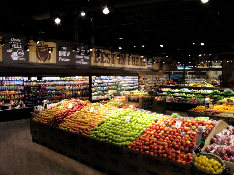
Store Lighting to Attract Customer Attention
Make the store space attractive and complete. Use the right lighting to create a special mood in the store and attract customers to certain areas of the sales floor or products on the shelves. Also use lighting to highlight individual items: new or promotional ones, and also use illuminated signs with promotional information.
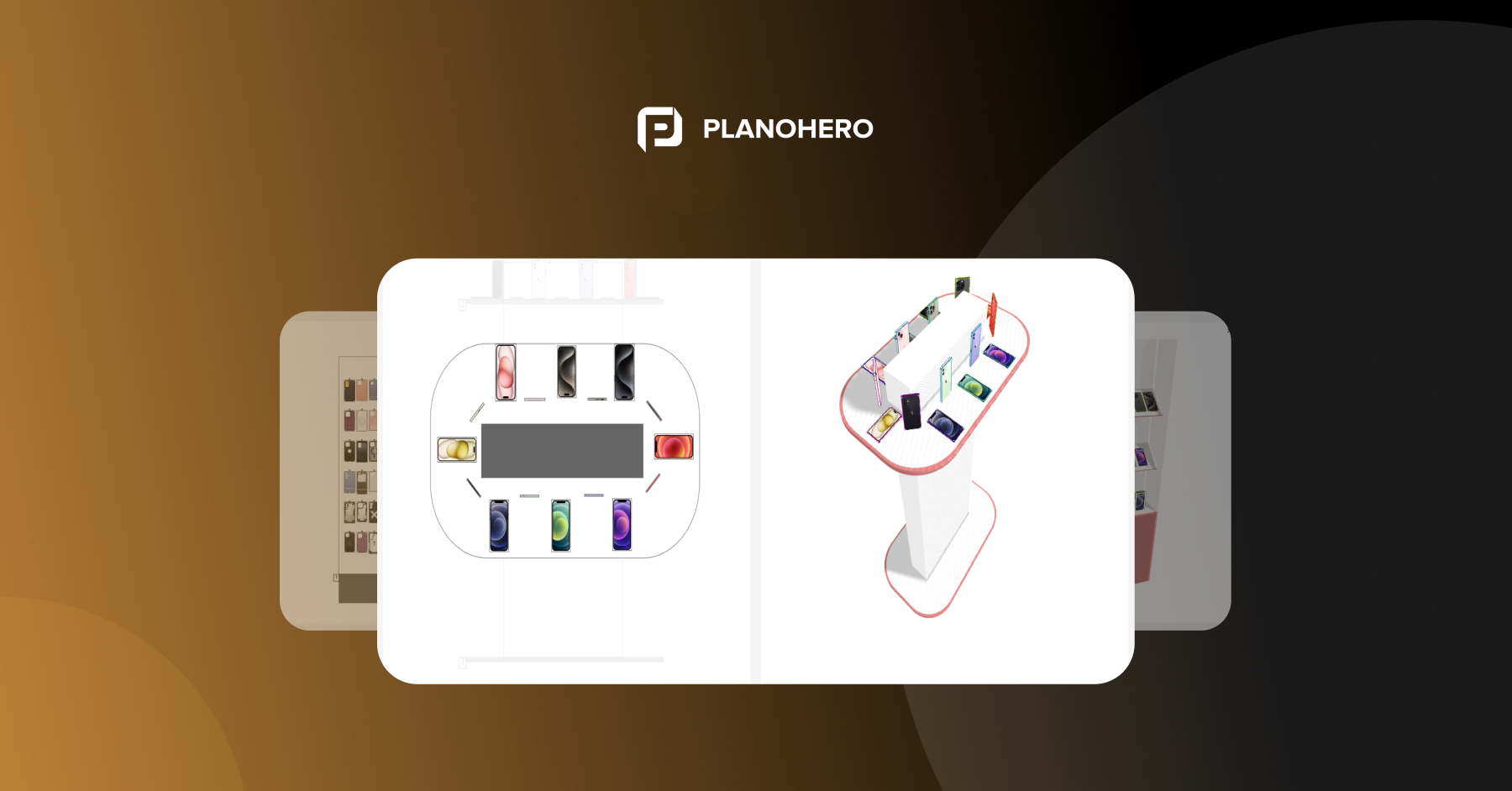
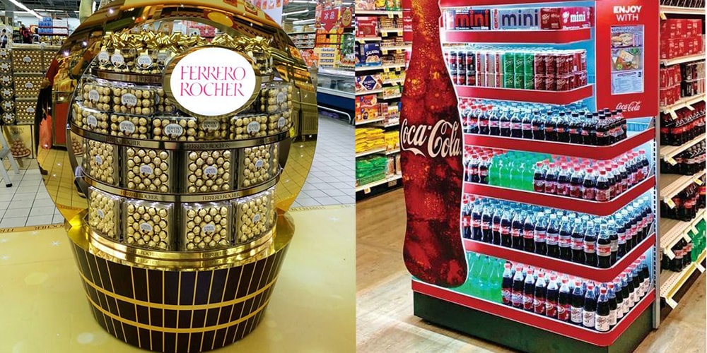
- Highlight the Selected Items with POP Displays (point-of-purchase displays, advertising racks, and displays)
Unique store fixtures are designed to highlight a separate brand. Advertising racks and displays attract with contrasting colors and often unusual shapes. They can be placed almost anywhere in the store, thus creating a "branded corner". They are intended for advertising and the sale of goods at the same time. They are often used during promotions or when a brand-new product appears. Think about areas of the trading floor that are not very bright and can be slightly diluted with contrasting colors by placing a POP display.
With the help of such mobile advertising racks, you can complement the open space, as well as direct customers around the store.
You can highlight the items with digital displays and tell the story of a product. But there could be also a negative aspect - a customer's distraction from other products. So keep tracking of product sales on the POP display and near the display racks, and change your display layout if sales drop.
- Store Space Planning
Create a store plan and place racks, cash registers, and other store fixtures and furniture on it. Think about the location of each rack, as this will affect the flow of customers. The layout of the store determines whether it will be comfortable for customers to move between the rows and how long they will stay in your store. When planning your store, take into account the area of the store, the size of the shop equipment, and the assortment of goods.
Visual merchandising experts think over the shopper's journey through the store to make them spend more time looking for a product and end up buying more than they planned.
You can easily create a store plan, design store equipment, and place it on the plan using the PlanoHero platform. This service helps retailers customize an effective merchandising process and manage all planogramming processes.
-
Effective Product Placement to Increase Sales in the Store
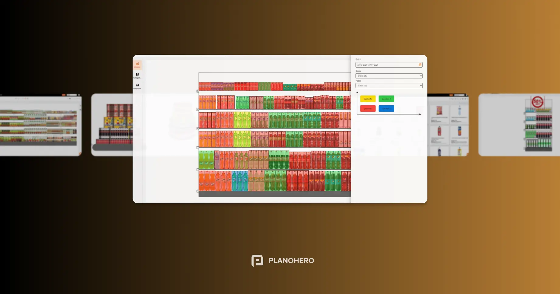
Shelf planning, display, layout, or product placement is a method of visual merchandising. This is a planned placement of goods to maximize customer attention to the product and increase sales. In order to properly place products in the store, first create planograms - visual plans for placing items on the shelves.
Review the basic product placement or visual merchandising strategies before you start creating product displays on a planogram.
Principles of Visual Merchandising or Product Placement
Cross Merchandising
Type of product placement, when, along with the main product, an additional item of another category is placed. This combination of goods increases the possibility of purchasing several items at once.
For example, some grocery stores often list items on a "recipe" basis. Therefore, nearby there may be goods-ingredients for preparing a recipe, for example, a popular local dish. For example, for making Carbonara pasta, customers can find cheese, sauces, mushrooms, bacon, etc. on neighboring racks next to pasta.
Eye-level Display
Place more expensive items at eye level. So they will be seen by a large number of buyers. Items with lower prices are usually placed below eye level.
Vendors even pay to place their products at eye level. So the products that shoppers are most likely to look for are on the shelves above or below.
Slow Sellers Next to Bestsellers
Place low-demand items alongside your most popular merchandise on the shelves. It increases the chance that customers will pay attention to a slow-moving product and probably buy it.
Bundle of Goods
Combine several related items into a bundle and sell them as a single unit. This is the practice of displaying goods in order to make it easier for customers and encourage them to purchase goods together. When considering such product bundles, analyze what items customers are already buying and add one or two more logically related products to this product.
Why is Visual Merchandising so Important?
Properly organized merchandising streamlines product placement in the store and encourages customers to make purchases. Organization, order, and logical placement of goods are things that should be visually noticeable to customers.
Merchandising covers all processes from the visual organization of goods on the shelves to the customers' traffic in the store. By analyzing all sales data, the retailer will understand how effective the in-store merchandising processes are.
Visual merchandising not only helps to attract customers and increase sales but also gives customers a reason to return to the store again. Buyers become repeat customers when they easily find the right product and feel comfort and care from the store side.
Looking for a service to create planograms?
Try a free demo version of PlanoHero

